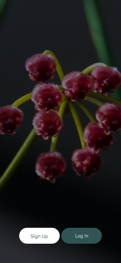
PLANTERISTA
Designing an app for amateur plant parents
✺ BROJECT BRIEF
Project Objective: Create a mobile app to assist new plant enthusiasts by providing easy access to plant care information and managing tasks such as watering, fertilizing, pruning, and harvesting.
Target User: Plant lovers who are beginning to explore plant care.
Identified Problem: Users need an app to help them learn about and manage plant care in a simple and accessible way.
✺ CONTEXT
Planterista was created in response to the growing popularity of plants over the past five years. This mobile application is designed to give new plant enthusiasts efficient access to information about their plants and assist them in managing tasks such as watering, fertilizing, pruning, harvesting, and other care-related activities.
To better understand user needs, a user story was developed: 'As an amateur plant caregiver, I want to better understand my plants and have control over their care.'
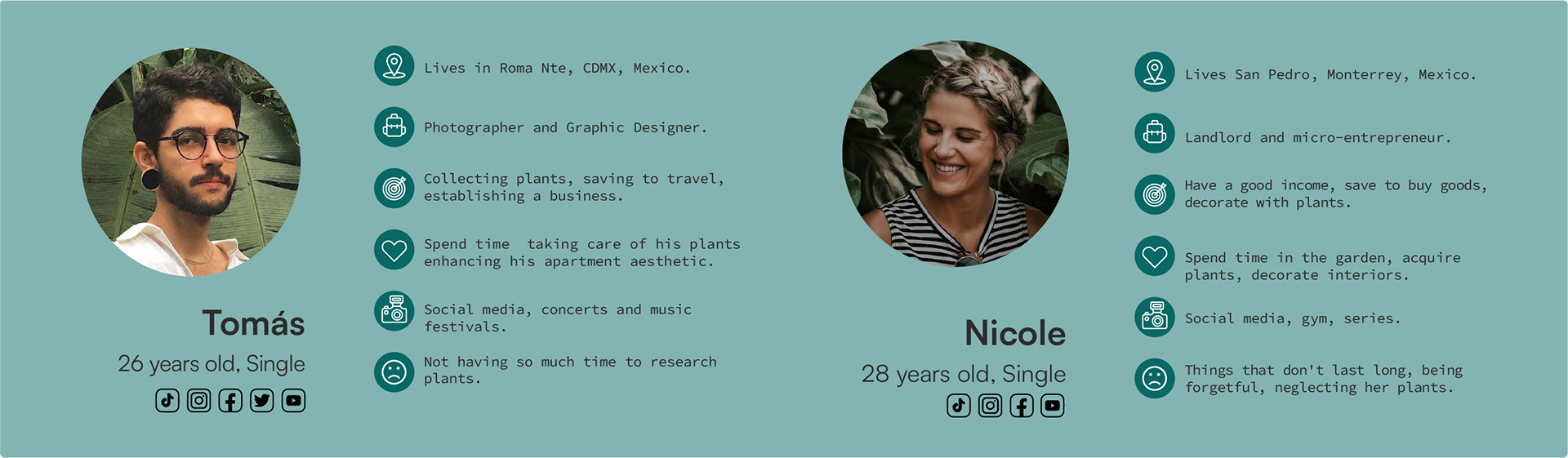
Additionally, a problem statement was identified: 'Tomas is a plant enthusiast who is just beginning to explore plant care. He needs an application that will help him learn about and manage the plants he acquires'.
Benchmarking and Opportunities: After analyzing similar apps, the idea of a social section emerged as a key opportunity area, allowing users to share their plant experiences. The main alterantive would be PlanIn.
✺ METHODOLOGY
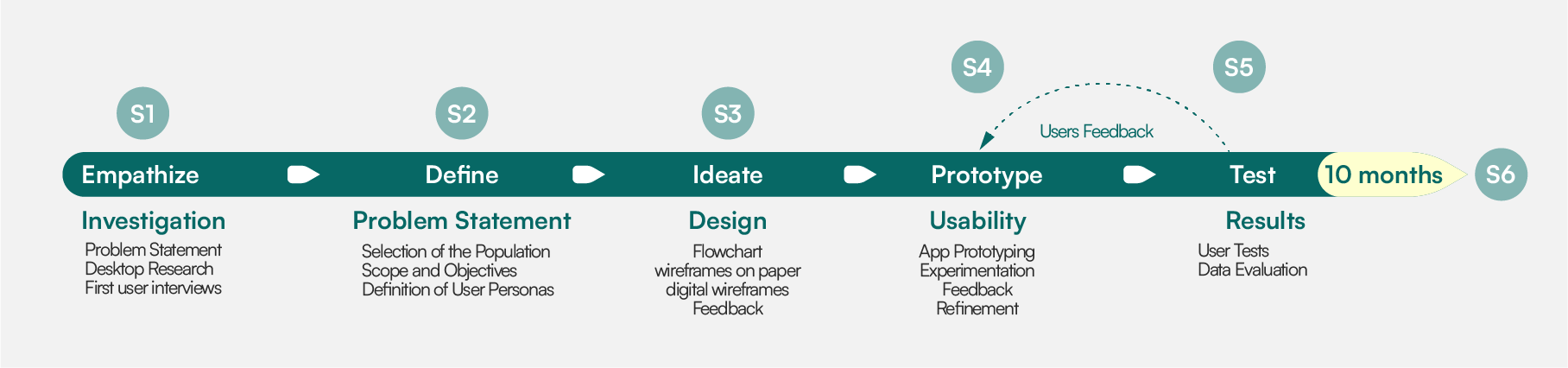
Empathize | Sprint 1
Objective: Set up the team and establish a foundational project scope.
Understand the users' needs and challenges within the project context.
① Problem Statement: Define the main problem the application seeks to solve and establish the project objectives.
② Desktop Research: Conduct secondary research to analyze existing solutions and user behaviors in the banking sector.
③ User Interviews: Design a questionnaire focused on gathering user feedback about usability, security, and desired features.
④ Feedback Review: Review the questionnaire with the Product Owner and incorporate feedback to ensure alignment with project goals.
Define | Sprint 2
Objective: Design and refine a user feedback questionnaire,
Refine the project scope and define the target users.
① Selection of the Population: Identify and define the application’s target population. Work on developing the questionnaire to gather user feedback. Include questions about usability, security, and desired application features.
② Scope and Objectives: Set the main scope and objectives of the project. Review the questionnaire and User Personas with the Product Owner and make adjustments based on their feedback.
③ Definition of User Personas: Create user personas based on initial interview data to guide the design focus.
④ Product Backlog: Create and prioritize the Product Backlog with key features such as the questionnaire and initial prototype.
Ideate | Sprint 3
Objective: Create and explore design solutions based on user research and needs analysis.
Create an initial grayscale wireframing to visualize the app’s core functionalities.
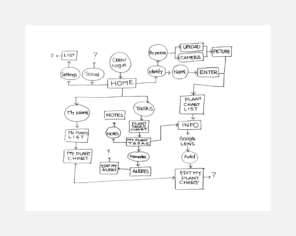
① Flowchart: Develop a flowchart to map the main navigation and user journey.
② Wireframes on Paper: Sketch wireframes on paper to visualize the app’s structure and layout.
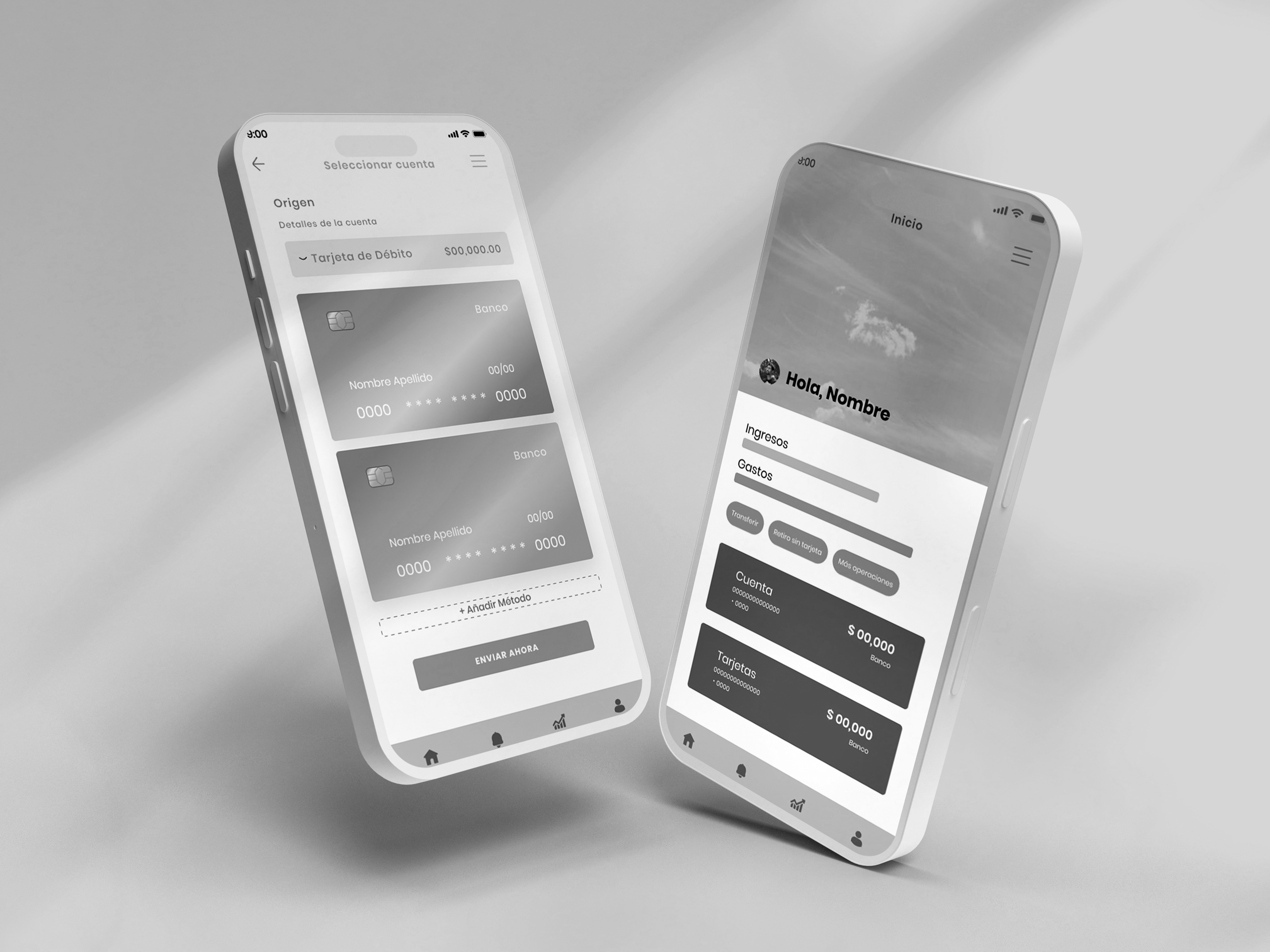
③ Digital Wireframes: Develop a low-fidelity (grayscale) prototype of the banking application, focusing on the login screens and the funds transfer process.
④ Feedback Incorporation: Conduct a prototype preview with the Product Owner and gather feedback for future improvements.
Prototype | Sprint 4
Objective: Develop and test a low-fidelity prototype to evaluate key functionalities.
Test the prototype and refine the user interface.
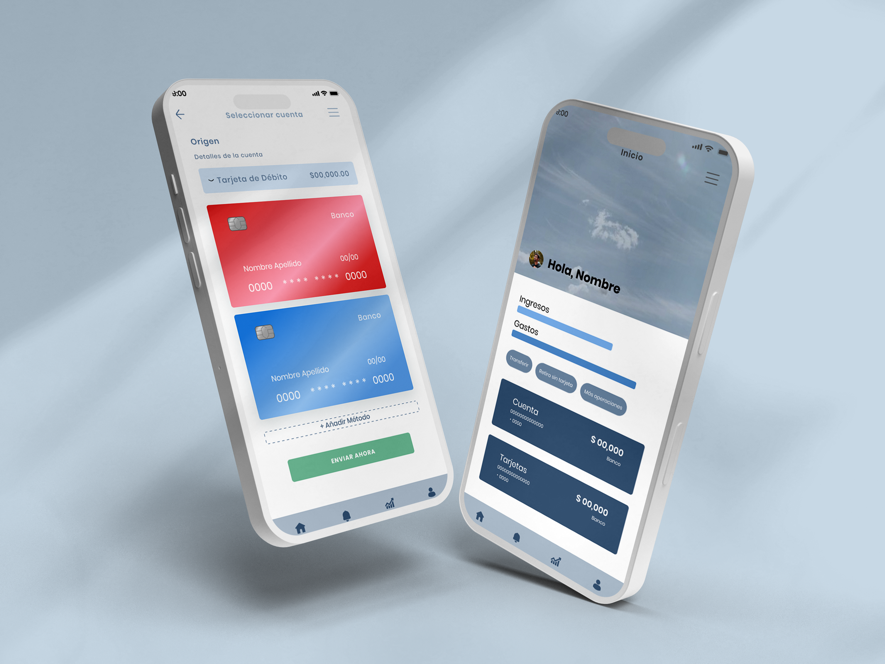
① App Prototyping: Create a medium-fidelity prototype of the banking app, focusing on key screens like login and funds transfer.
② Experimentation: Test and adjust different design elements within the prototype.
③ Usability Testing: Conduct internal usability testing to identify issues and gather feedback.
④ Refinement: Improve the prototype based on testing outcomes to optimize the user interface.
Test | Sprint 5
Objective: Validate the final design through testing and ensure it meets user expectations.
Finalize key features and map the user experience.
① User Tests: Conduct final usability tests on the refined prototype, focusing on user experience and satisfaction.
② Data Evaluation: Analyze test data to identify necessary final adjustments before delivery.
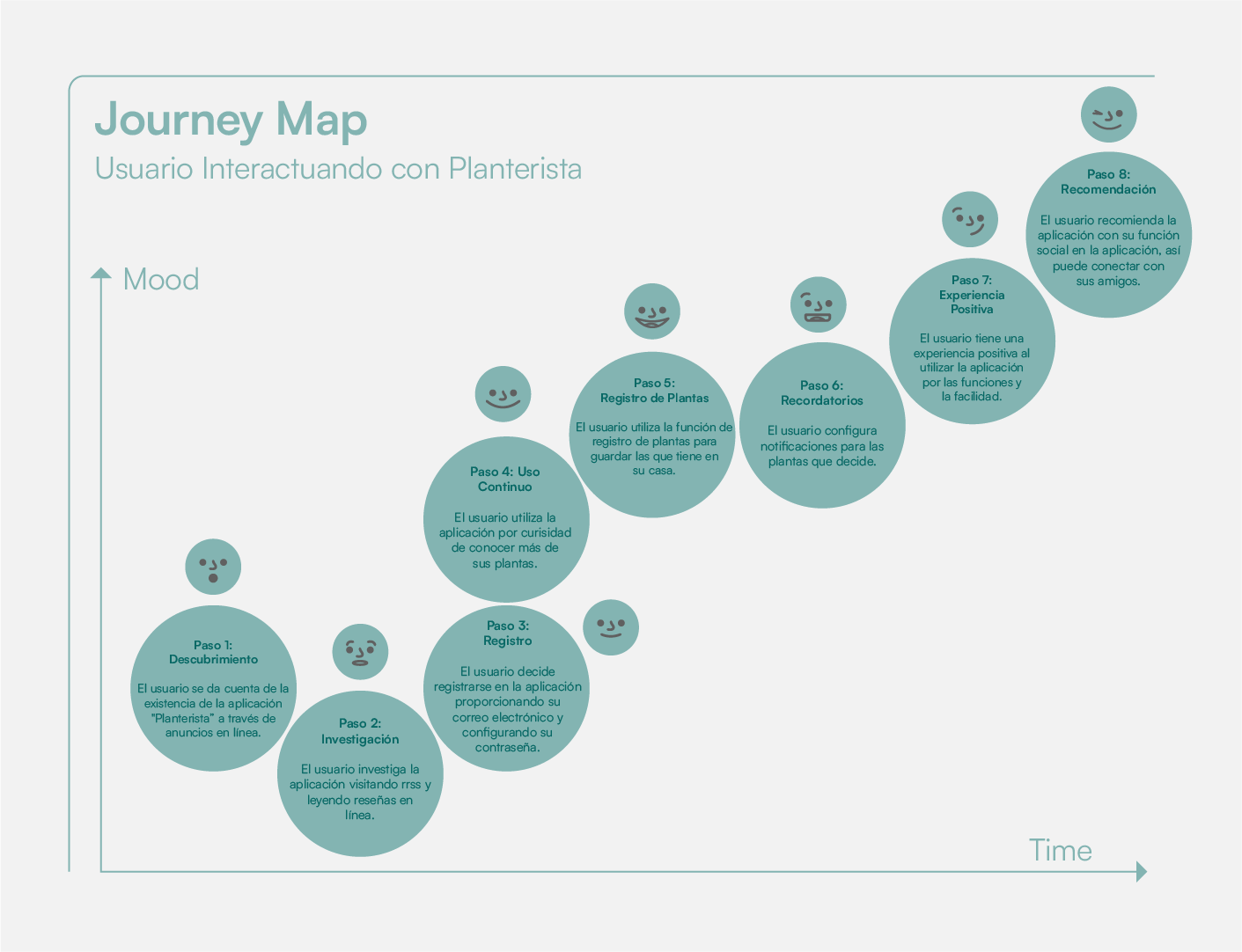
③ Customer Journey Map: Create a Customer Journey Map that captures key interactions and emotions as users navigate the app.
Deliver | Sprint 6
Objective: Complete final adjustments and deliver the finished app with comprehensive documentation.
Deliver the completed application and project documentation.
① Final Product Review: Conduct a final product review to ensure all features and adjustments are complete.
② Application Delivery: Deliver the app, feedback questionnaire, and Customer Journey Map to the client.
③ Project Closure Meeting: Hold a project closure meeting to evaluate project success, gather insights for future improvements, and formally close the project.
✺ QUESTIONNAIRE
① How often do you take care of your plants?
Response: Most surveyed users take care of their plants at least once a week, with a few checking daily for watering or other tasks.
Response: Most surveyed users take care of their plants at least once a week, with a few checking daily for watering or other tasks.
② What challenges do you face when caring for your plants?
Response: Users often report forgetting when to water or fertilize, as well as difficulty identifying specific care needs for different plant species.
Response: Users often report forgetting when to water or fertilize, as well as difficulty identifying specific care needs for different plant species.
③ What features would you like to see in an app designed for plant care?
Response: Users are most interested in reminders for watering, fertilizing, and pruning, along with detailed care information specific to each plant type.
Response: Users are most interested in reminders for watering, fertilizing, and pruning, along with detailed care information specific to each plant type.
④ What motivates you to care for your plants?
Response: Many users enjoy the therapeutic aspect of caring for plants, while others are motivated by the aesthetic and environmental benefits of having indoor plants.
Response: Many users enjoy the therapeutic aspect of caring for plants, while others are motivated by the aesthetic and environmental benefits of having indoor plants.
⑤ How comfortable are you with using mobile apps to manage your plant care?
Response: Most users are comfortable with using apps, but they prefer a simple and intuitive interface with minimal complexity.
Response: Most users are comfortable with using apps, but they prefer a simple and intuitive interface with minimal complexity.
⑥ Would you like to connect with other plant enthusiasts through an app?
Response: A significant number of users express interest in a social feature that allows them to share plant care experiences and tips with others.
Response: A significant number of users express interest in a social feature that allows them to share plant care experiences and tips with others.
⑦ How important is it for you to have detailed plant care information in an app?
Response: Users find detailed plant care guides very important, particularly when it comes to specific needs like light exposure, temperature, and humidity levels.
Response: Users find detailed plant care guides very important, particularly when it comes to specific needs like light exposure, temperature, and humidity levels.
⑧ Would you use a feature that allows you to track your plant's growth and health?
Response: Many users find the idea of tracking their plants' health appealing, as it helps them stay organized and ensures they are providing the right care.
Response: Many users find the idea of tracking their plants' health appealing, as it helps them stay organized and ensures they are providing the right care.
⑨ How do you feel about gamification elements, like earning badges or rewards for plant care tasks?
Response: Users are generally open to gamification elements, especially if they can enhance engagement and motivation to complete plant care tasks on time.
Response: Users are generally open to gamification elements, especially if they can enhance engagement and motivation to complete plant care tasks on time.
⑩ What do you think is the most important factor in a plant care app?
Response: Most users agree that the most important factor is ease of use, followed by timely reminders and the ability to access information quickly.
Response: Most users agree that the most important factor is ease of use, followed by timely reminders and the ability to access information quickly.
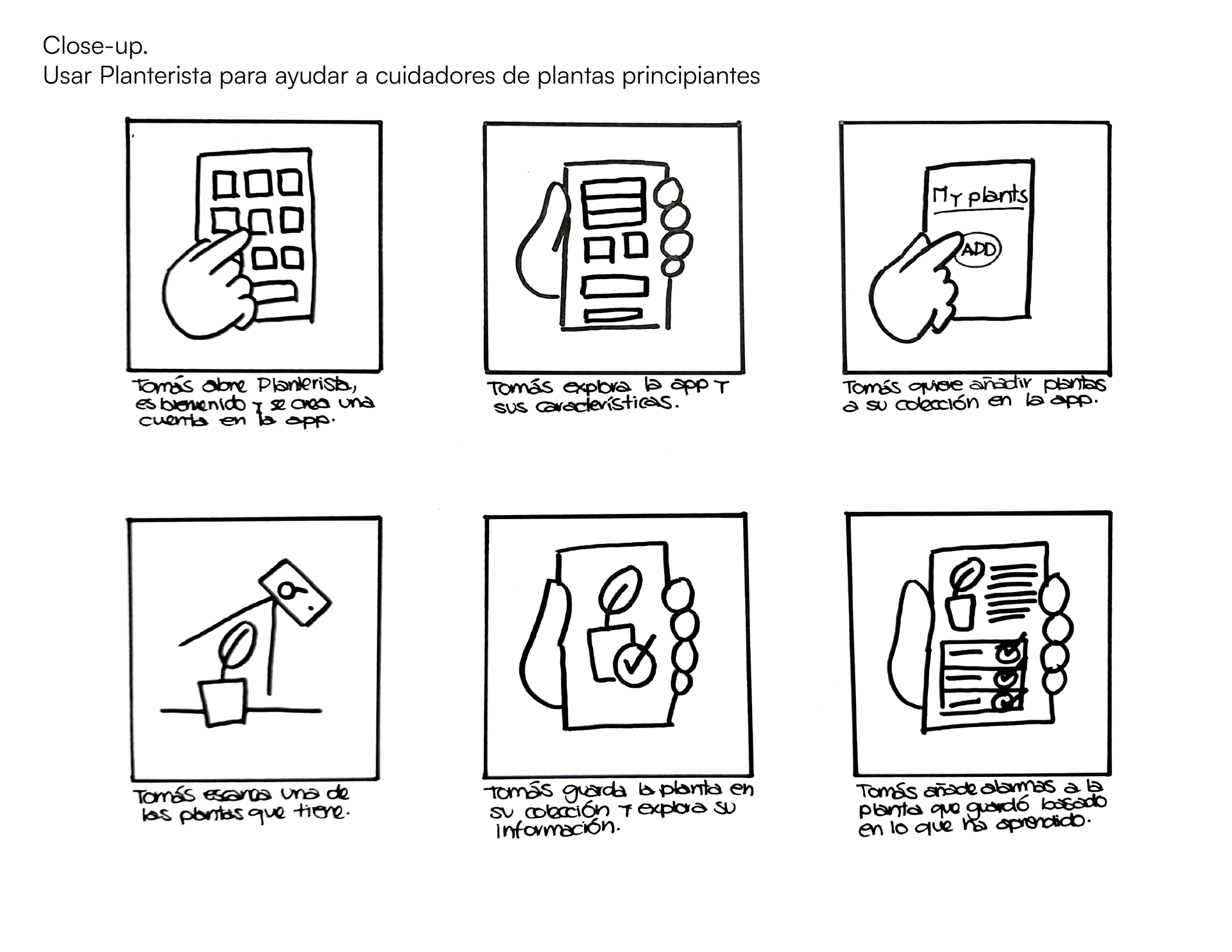
✺ IDEATION AND SOLUTION SKETCKING
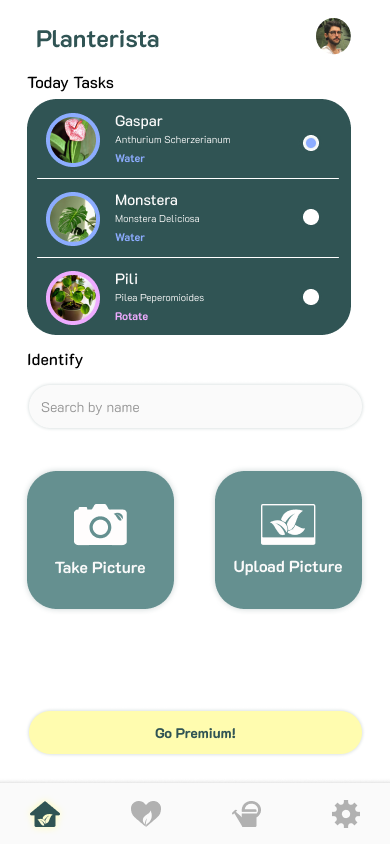
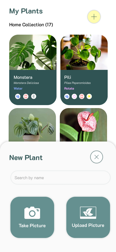
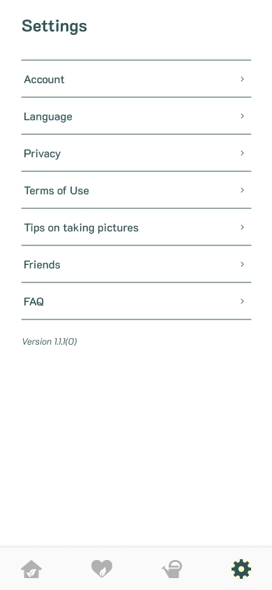
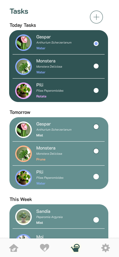
Initial Structure and Navigation: A flowchart was designed to outline user navigation, focusing on four main sections: Home, My Plants, Tasks, and Settings.
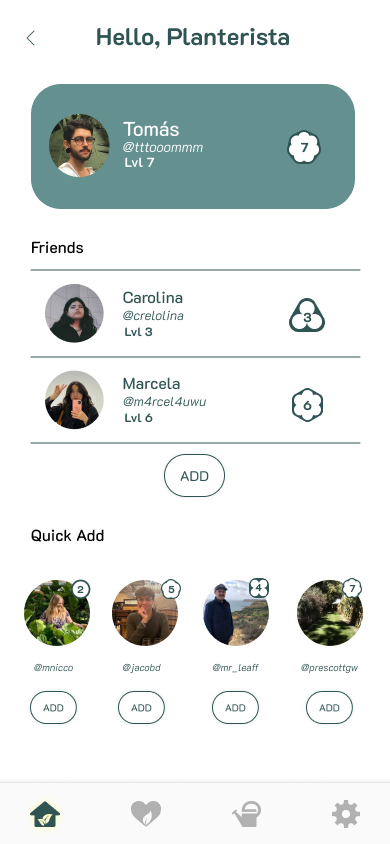
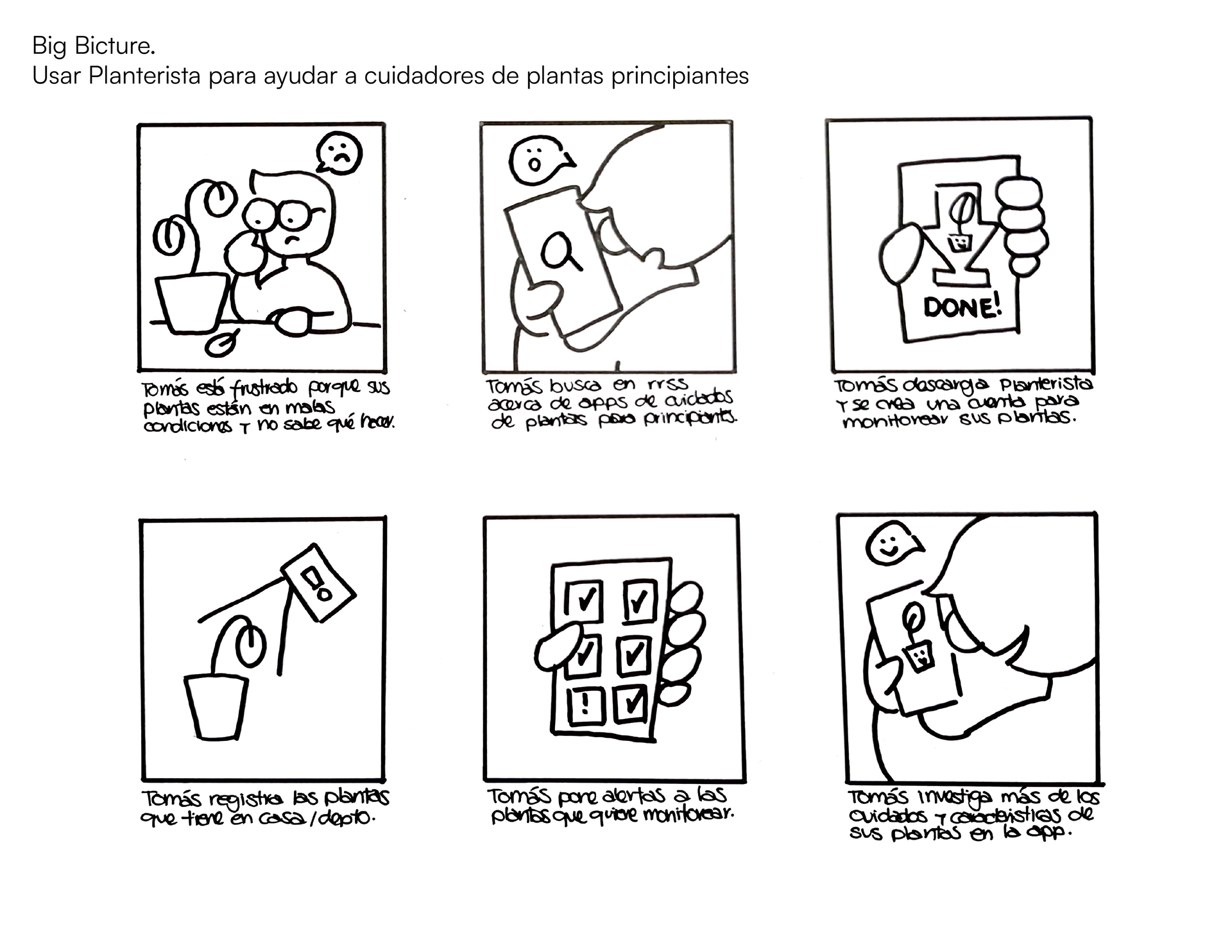
Storyboards: Storyboards were created, both at the big-picture and close-up levels, to explore user interactions with the app and its key features. This exercise led to the idea of a social section, highlighting a potential feature to differentiate the app from competitors.
✺ PROTOTYPING
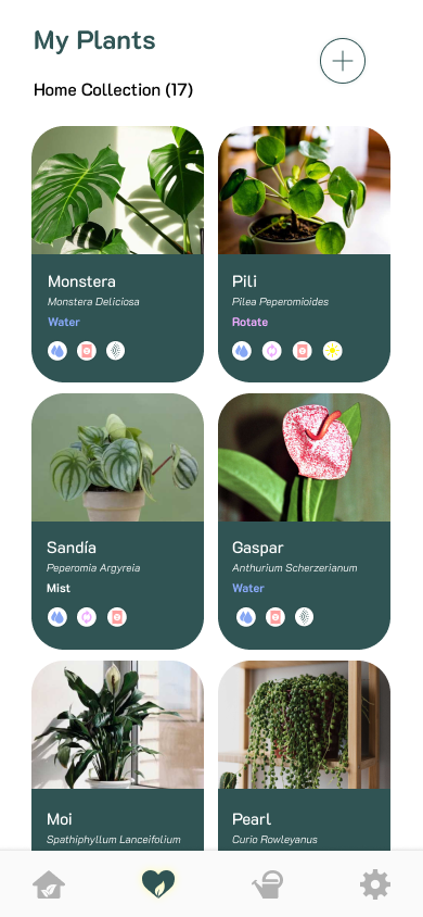
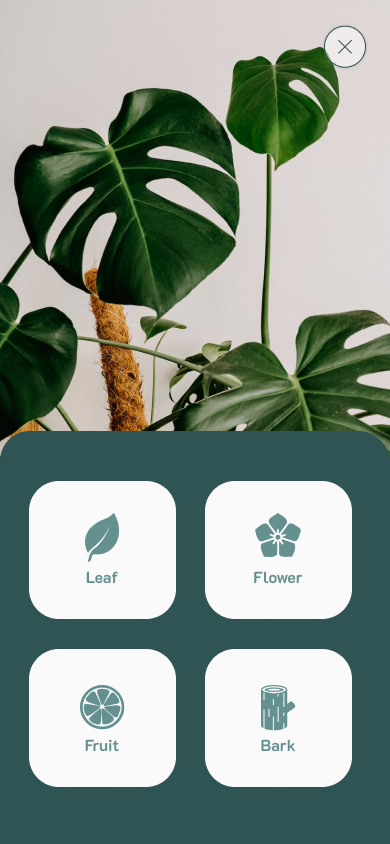
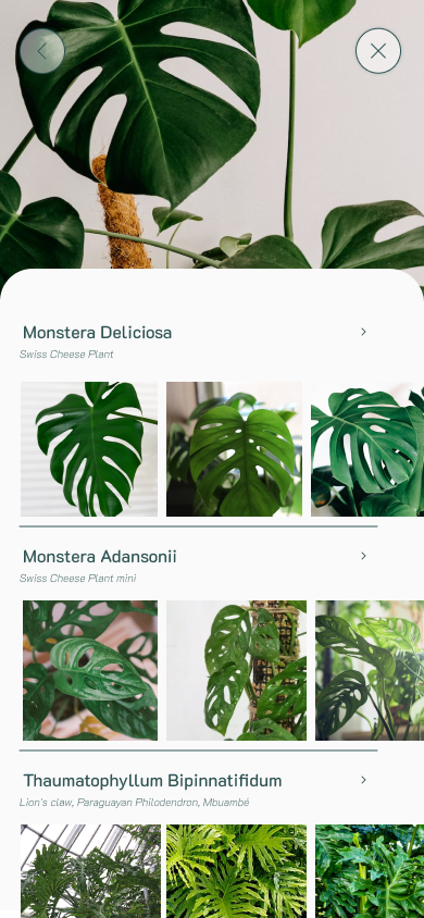
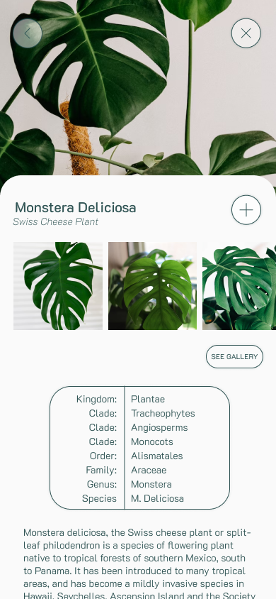
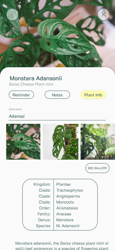
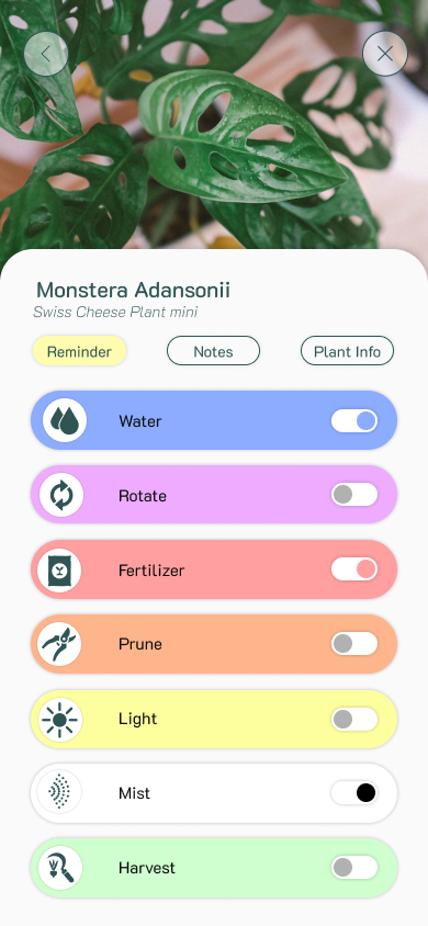
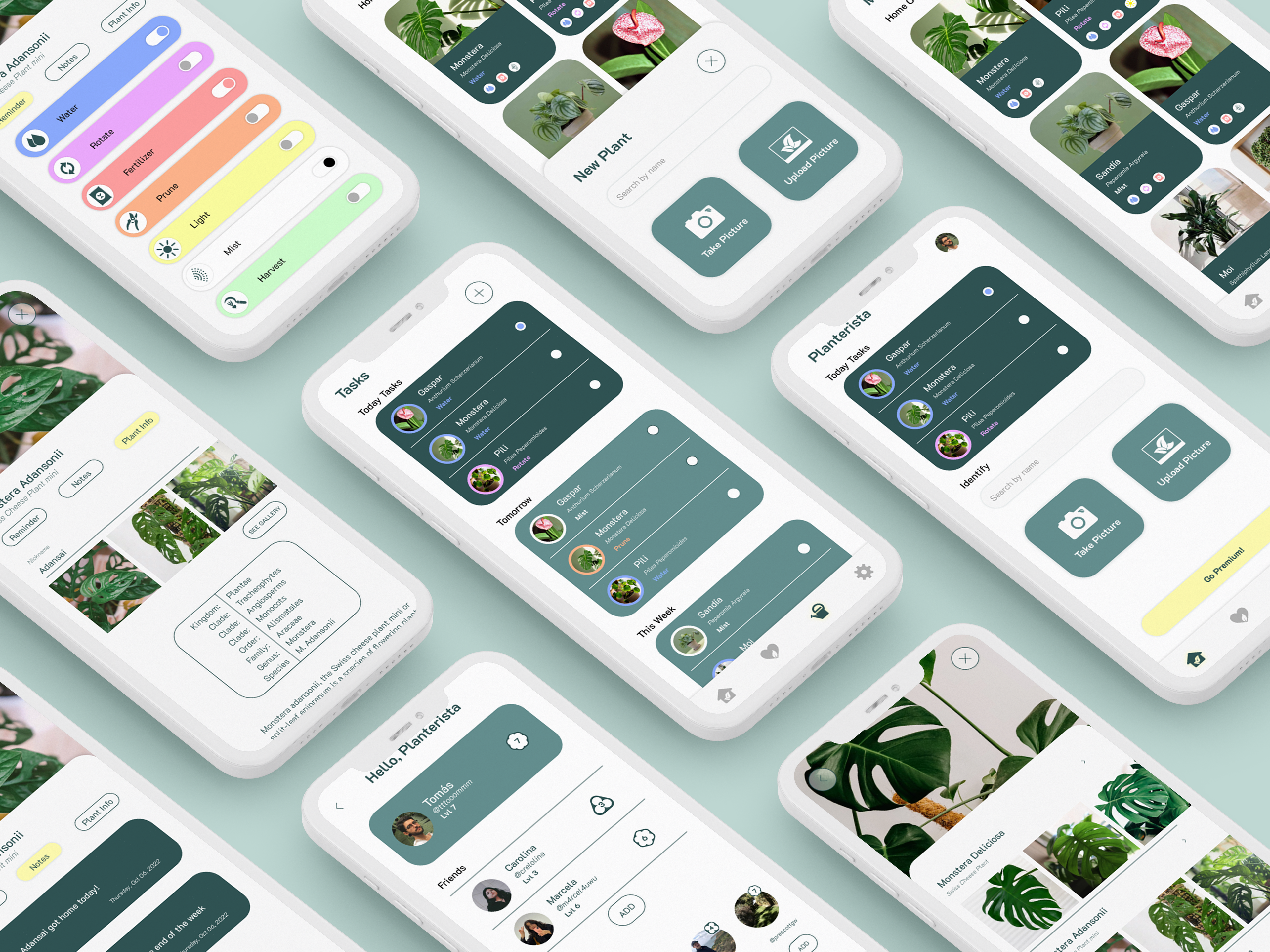
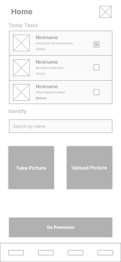
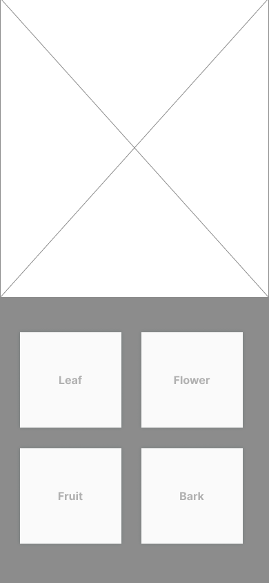
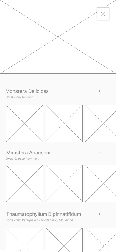
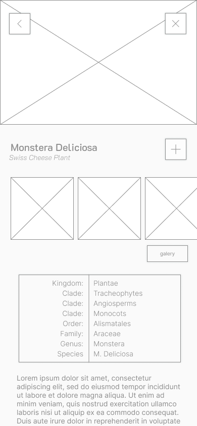
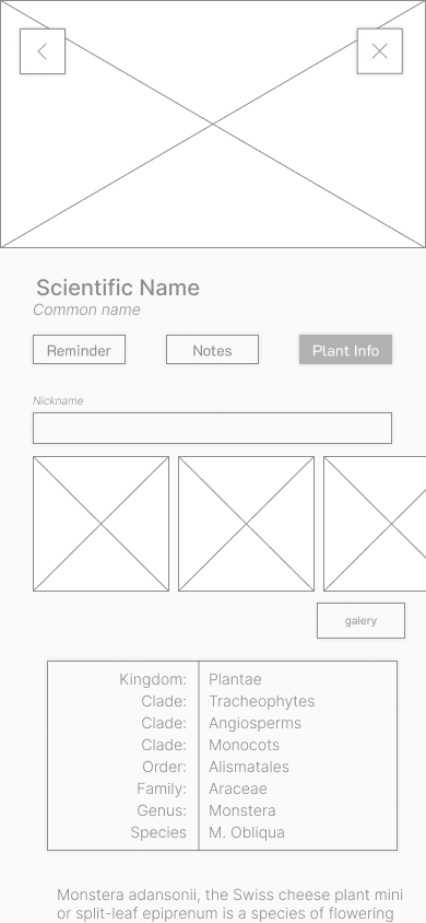
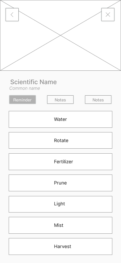
Wireframes: Initial wireframes were sketched on paper based on the flowchart, mapping out the user journey for identifying and adding plants to their collection. These wireframes incorporated features like setting care reminders, accessing specific plant information, and using a search function to add plants easily.
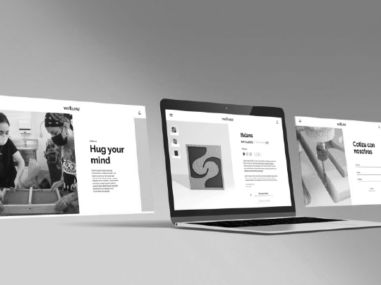
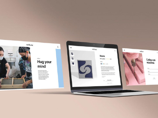
Digital Prototyping: The wireframes were transferred to Figma for feedback from the design team, which helped refine the details and transform them into a digital prototype.
Usability Testing: The prototype was validated through usability testing with potential users. Based on feedback, a social tab was introduced, as users expressed interest in sharing their plant experiences with friends.

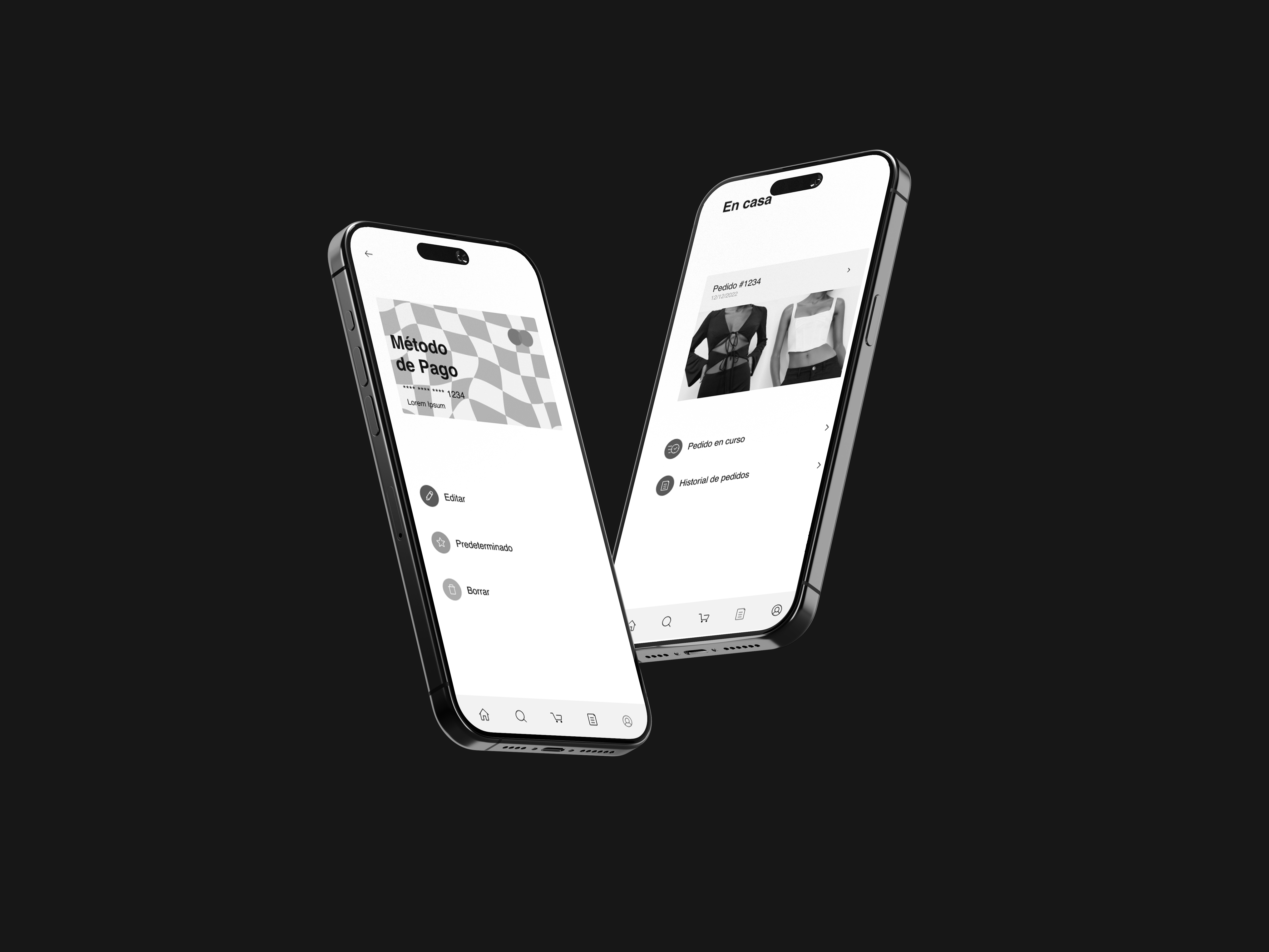
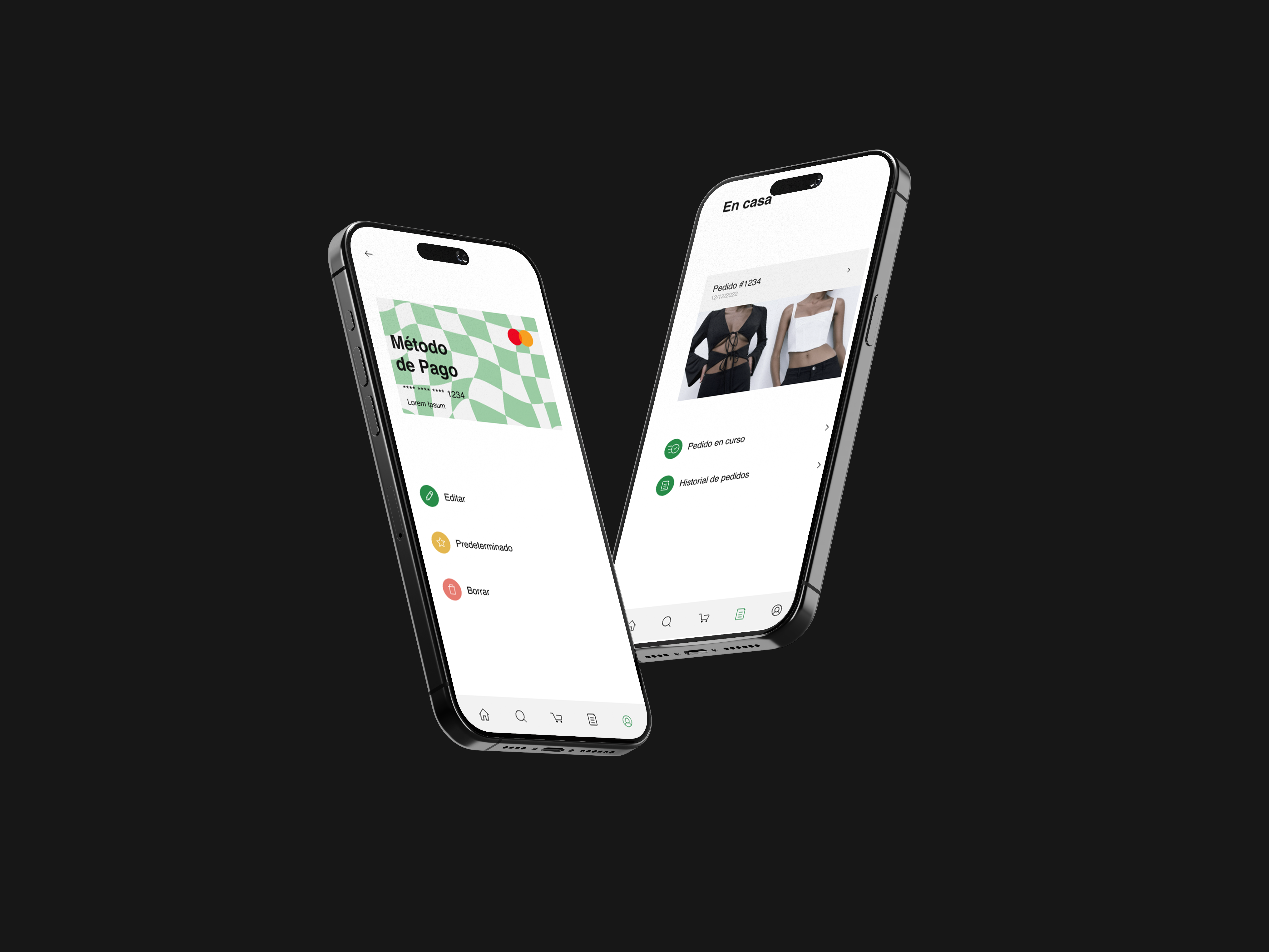
✺ INTERFACE DESIGN
Social Tab and Gamification: In the social tab, users can earn badges based on their account level, which is directly related to successfully completed tasks and timely care rates. This feature encourages user engagement and adds a social aspect to the app experience.
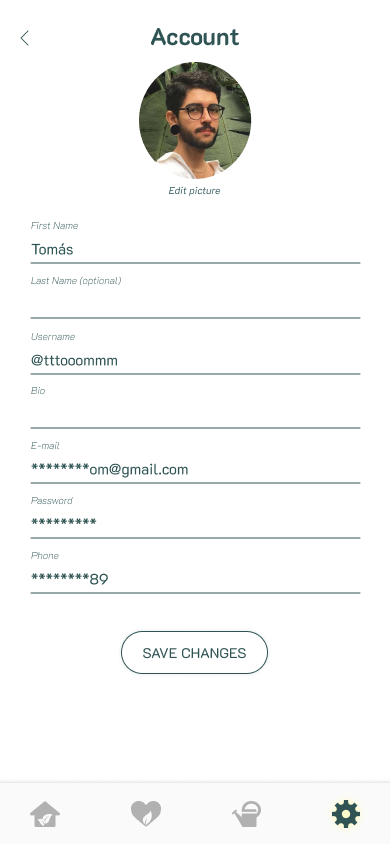
Visual Design and Aesthetics: The app's visual identity was finalized with the K2D font in various weights, using two primary colors: a green with HEX: #305454 and a yellow with HEX: #FFFCaf.
✺ TESTING AND REFINEMENT
User Feedback Integration: Based on feedback from testing, navigable paths and aesthetics were fine-tuned to create a more intuitive user experience.
✺ USABILITY TESTING RESULTS
Objective: To evaluate the usability of the "Planterista" app prototype, focusing on ease of navigation, clarity of information, and overall user satisfaction.
Test Participants
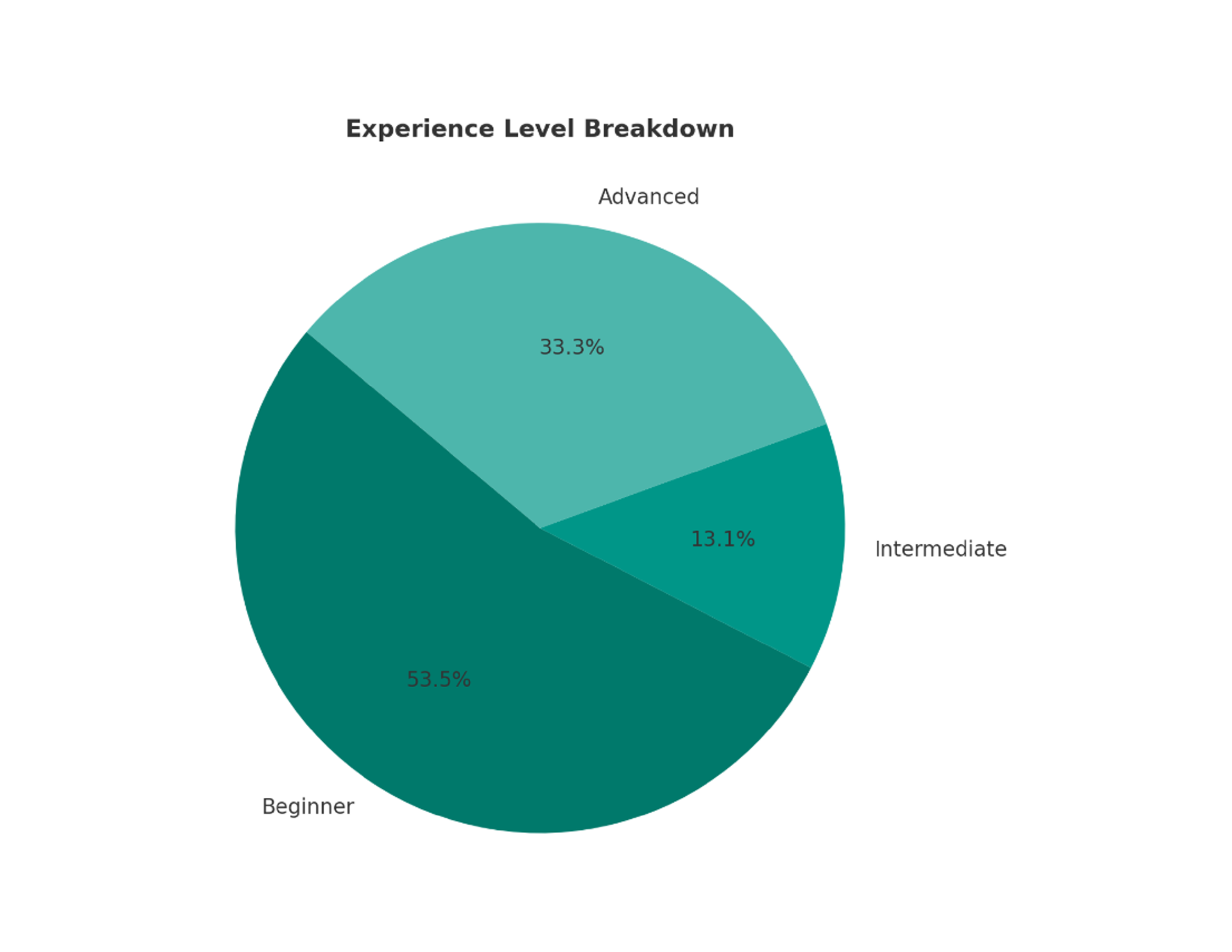
Number of Participants: 15
Demographics:
• Age: 25–40
• Experience with plant care: Beginner (8), Intermediate (2), Advanced (5)
• Familiarity with mobile apps: Medium
Demographics:
• Age: 25–40
• Experience with plant care: Beginner (8), Intermediate (2), Advanced (5)
• Familiarity with mobile apps: Medium
Tasks and Results:
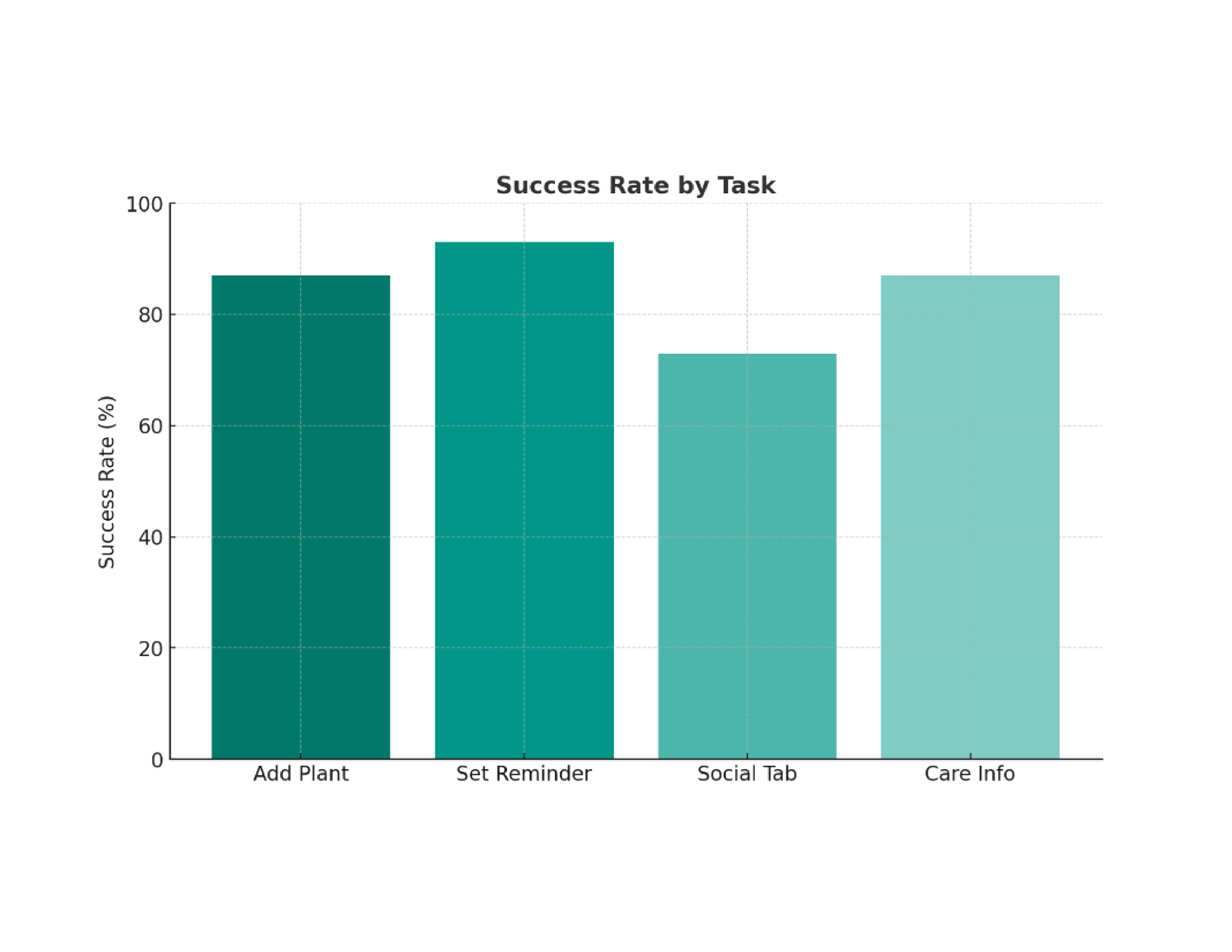
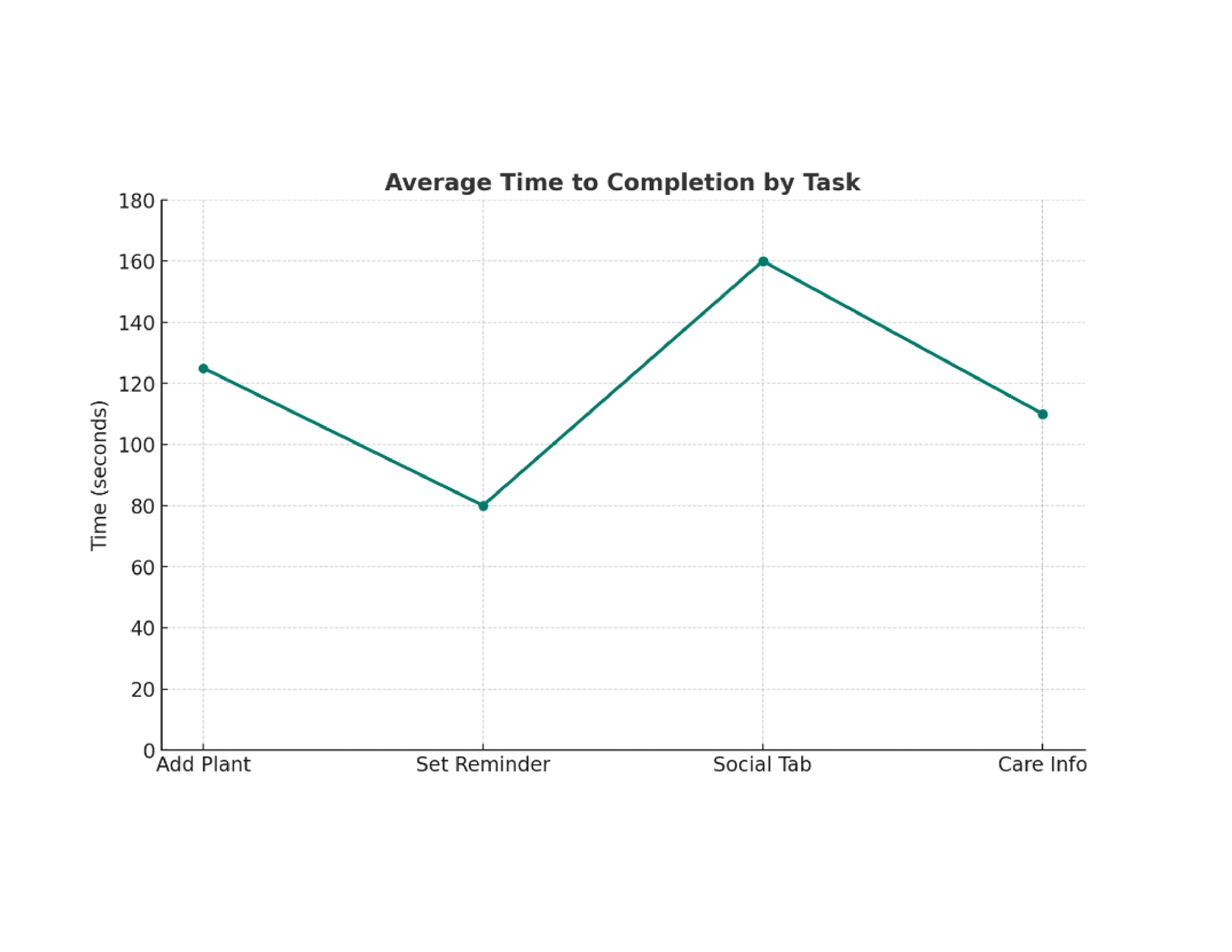
Task 1: Add a new plant to your collection.
• Success Rate: 87% (13/15 participants)
• Average Time to Completion: 2 minute 5 seconds
• Key Feedback: Beginners found the search function unclear, suggesting the need for a more prominent search bar. Advanced users completed the task faster and highlighted the comprehensive plant database.
• Average Time to Completion: 2 minute 5 seconds
• Key Feedback: Beginners found the search function unclear, suggesting the need for a more prominent search bar. Advanced users completed the task faster and highlighted the comprehensive plant database.
Task 2: Set a watering reminder for an existing plant.
• Success Rate: 93% (14/15 participants)
• Average Time to Completion: 1 minute 20 seconds
• Key Feedback: Most users praised the simplicity of the feature, though one advanced user suggested adding customizable intervals.
• Average Time to Completion: 1 minute 20 seconds
• Key Feedback: Most users praised the simplicity of the feature, though one advanced user suggested adding customizable intervals.
Task 3: Navigate to the social tab and post a plant care update.
• Success Rate: 73% (11/15 participants)
• Average Time to Completion: 2 minutes 40 seconds
• Key Feedback: Intermediate and beginner users struggled to locate the social tab icon. Advanced users appreciated the idea of a social feature but suggested integrating a plant-sharing option.
• Average Time to Completion: 2 minutes 40 seconds
• Key Feedback: Intermediate and beginner users struggled to locate the social tab icon. Advanced users appreciated the idea of a social feature but suggested integrating a plant-sharing option.
Task 4: Access detailed care instructions for a specific plant.
• Success Rate: 87% (13/15 participants)
• Average Time to Completion: 1 minute 50 seconds
• Key Feedback: Beginners valued the clarity of care instructions but recommended adding video tutorials or step-by-step visuals.
• Average Time to Completion: 1 minute 50 seconds
• Key Feedback: Beginners valued the clarity of care instructions but recommended adding video tutorials or step-by-step visuals.
Analysis of Data
① High Task Success Rates: Tasks 2 and 4 performed well across all experience levels.
② Areas for Improvement:
• Search bar visibility: Beginners reported difficulties in Task 1, indicating a need for UI adjustments.
• Social tab navigation: Over 25% of users struggled with Task 3, mainly beginners and intermediate users.
③ Experience-Level Trends:
• Beginners benefited from clear guidance but required more visual aids.
• Advanced users suggested additional features like plant-sharing options or advanced care settings.
Recommendations
① Redesign the search bar for better visibility in the "Add Plant" screen.
② Adjust the social tab icon to make it more intuitive.
③ Add video tutorials and visual aids to plant care instructions for beginner users.
④ Introduce advanced features (e.g., customizable care reminders, plant-sharing options) to cater to experienced users.
✺ PROJECT DELIVERY
Documentation: A comprehensive report detailing the design process, decisions made, and key insights learned.
Final Presentation: A presentation covering the full design process and showcasing the final product.