WELTUNE
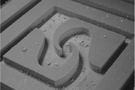
Generating a company which markets acoustic panels made out of concrete using CNC router.
✺ CONTEXT
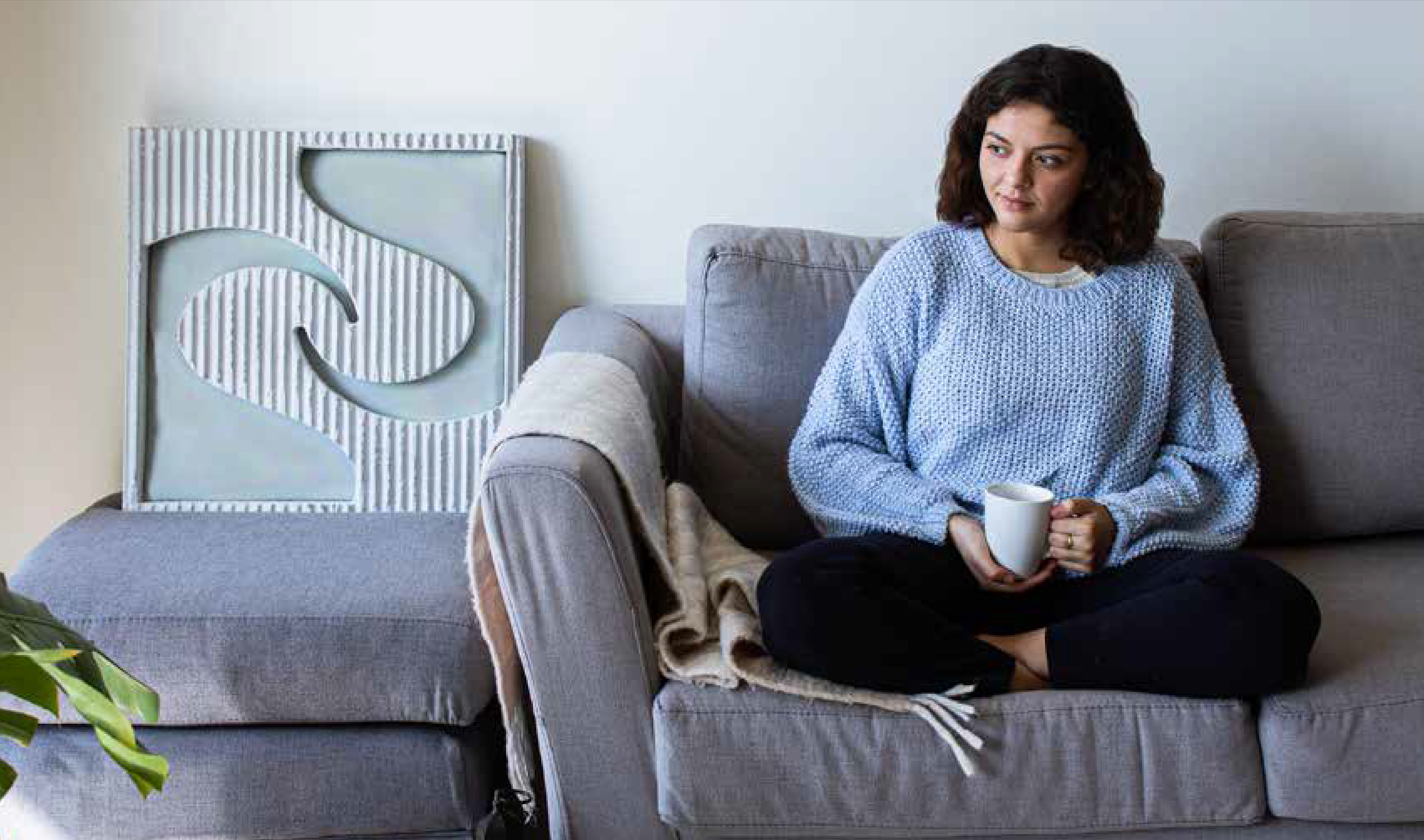
We were assigned a design brief with the primary goal of 'creating a company and a marketable product made of concrete.' This project required us to consider the global situation during the SARS-CoV-2 (COVID-19) pandemic, which caused widespread confinement from 2020 through 2021. Many individuals who transitioned from face-to-face work to working from home lacked a comfortable environment. In Mexican cities, where living spaces are often small and shared with family members, roommates, pets, etc., this created significant interference with daily activities. Consequently, our research highlighted a pressing need to reduce noise levels within the home.
✺ The Main Goal
Enhance the experience of Mexicans working from home by providing a product that supports their home office setup and includes an option for digital service purchases. The goal is to address the need for noise reduction in personalized indoor environments, thereby minimizing distractions and irritations, and promoting a better work-life balance by reducing stress.

✺ METHODOLOGY, TIMELINE & DELIVERABLE

DELIVERABLES:
• Project research, thesis format (BOOK)
• High fidelity prototype
• Web page
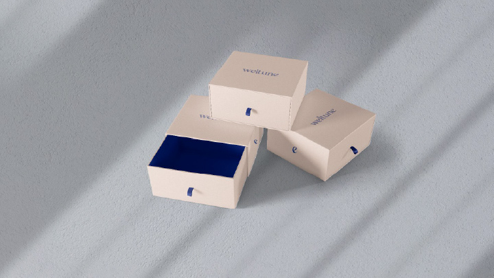
• Packaging
• Commercial
• Branding and Marketing Strategy
• Sample of customer experience
• High fidelity prototype
• Web page
• Packaging
• Commercial
• Branding and Marketing Strategy
• Sample of customer experience


✺ PERSONAS
The team developed two user personas: both millennials with A/B and C+ socioeconomic status. They are activists, highly connected, socially active, and lead busy lives with a strong sense of community.
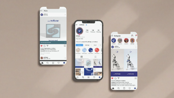
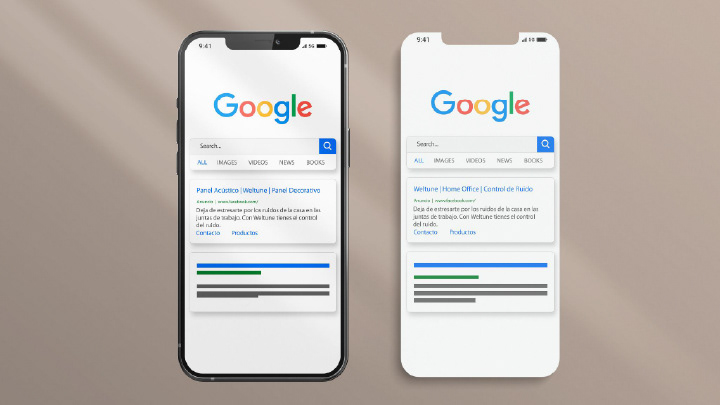
In collaboration with the marketing team, we crafted a media strategy plan in three phases, entirely digital and primarily focused on social networks. Additionally, we worked on keyword strategies with Google Ads, utilizing both the 'Display Network' and 'Search Network' to target these profiles. The goal was to generate leads and attract potential customers to the website.

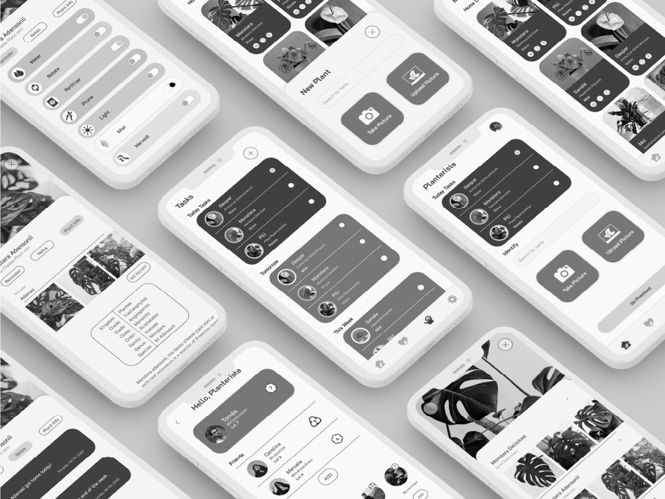
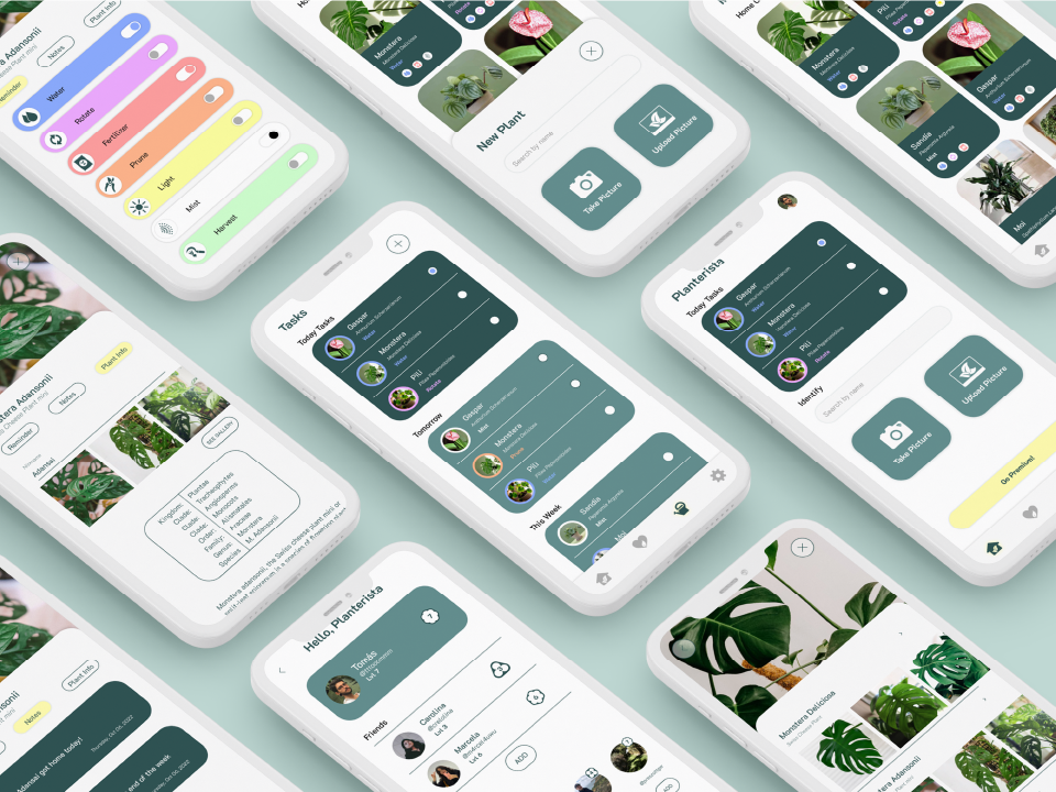
✺ INTERFACE DESIGN
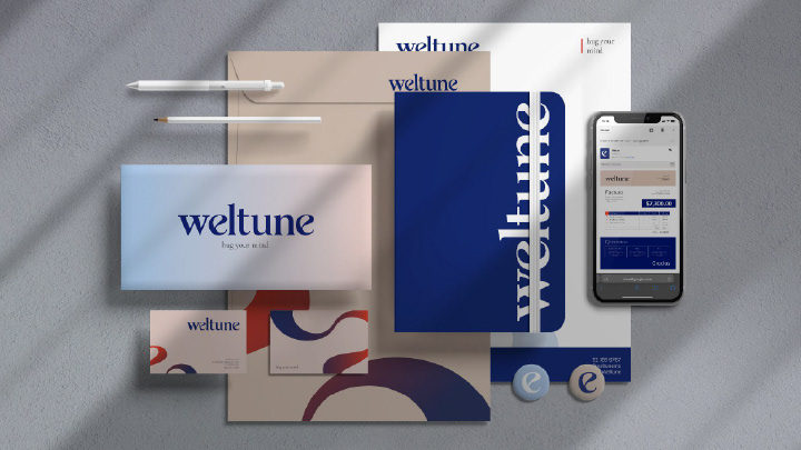
The project began with developing the Graphic Identity in collaboration with the Graphic Design and Marketing Teams. We explored various references for serif-style fonts due to their readability and the continuity they convey through their characters. The initial base typeface selected was 'Butler' in medium weight, from which elements like the antler, the shape of the foot in the letter 'n,' and the finial of the letter 't' were utilized. For the second base typeface, 'Magensburg' in regular weight was chosen for its fluid style. We specifically used the letter 'e' from this typeface for its unique shape, which represents the waves and movement of sound.
With the references in place, we experimented with combining these elements. Corrections were necessary to ensure cohesion, including modifying the endings of all letters to be curved, creating a consistent sense of movement and continuity. We also adjusted the kerning to harmonize the positive and negative spaces of each letter, achieving a balanced final logo.
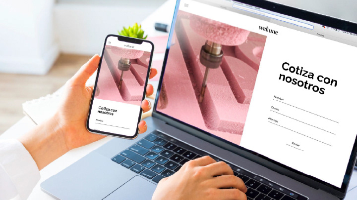
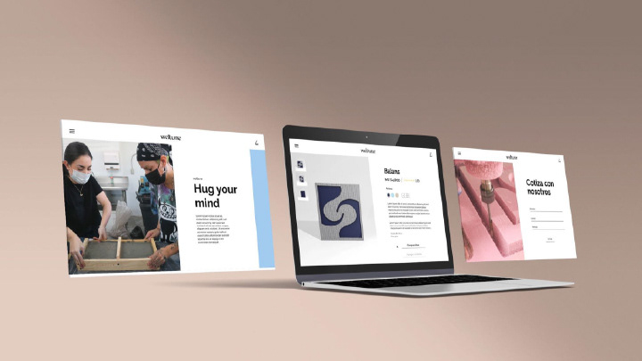
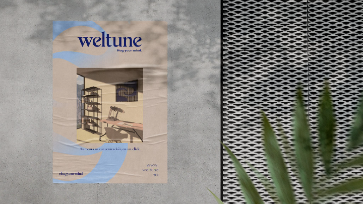
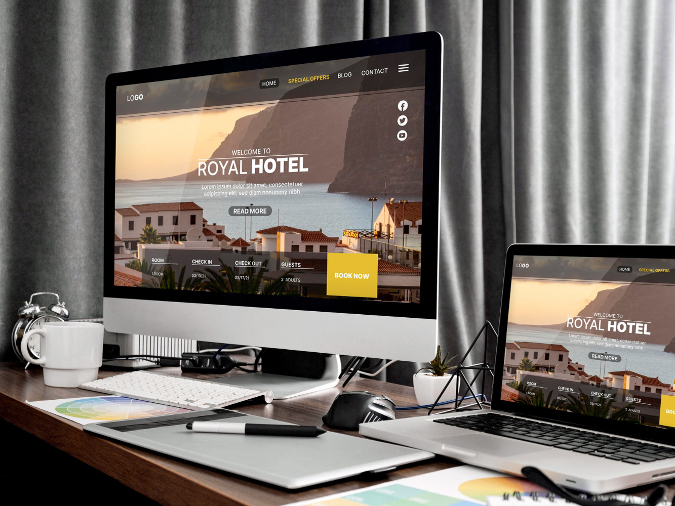
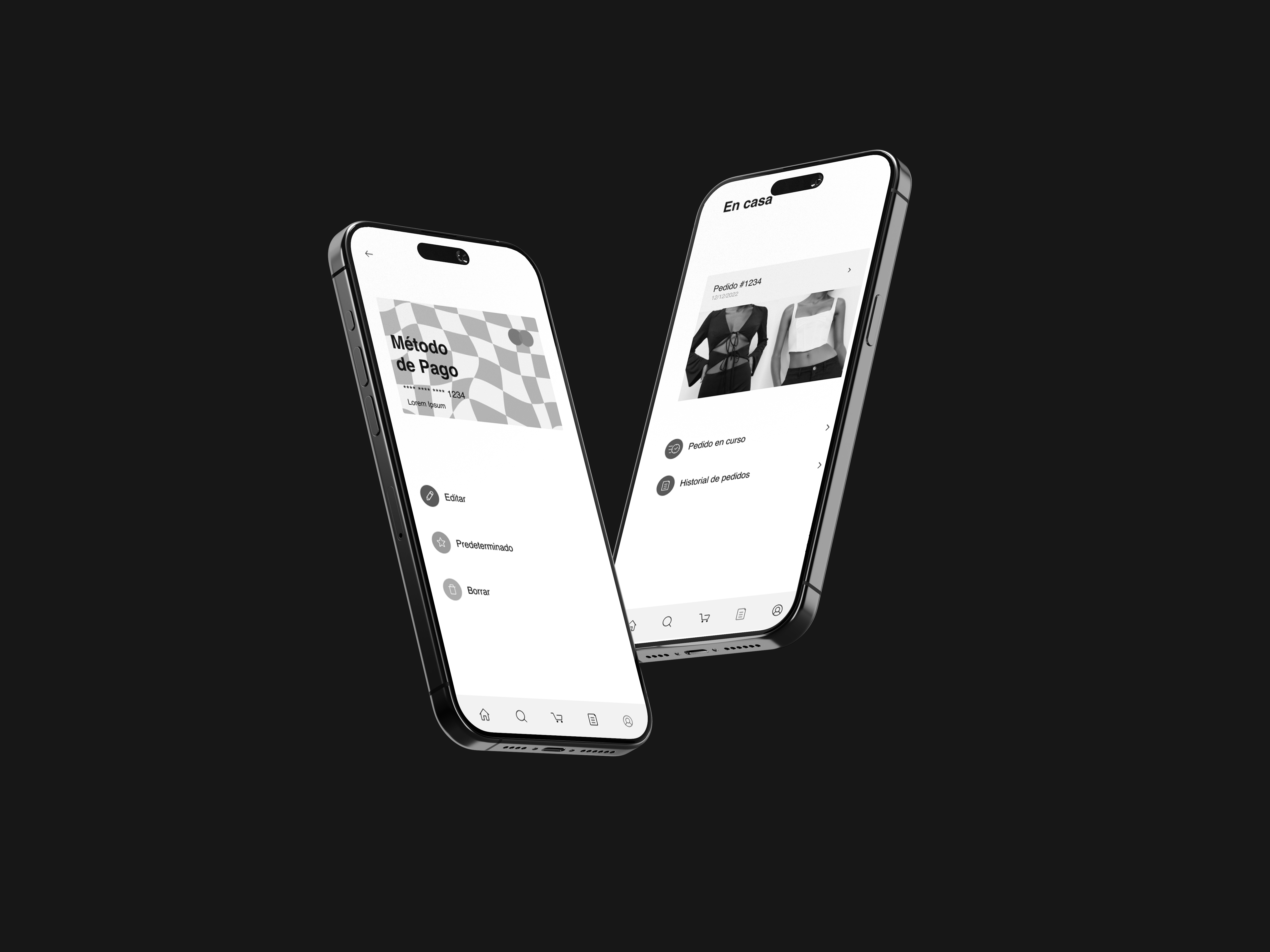
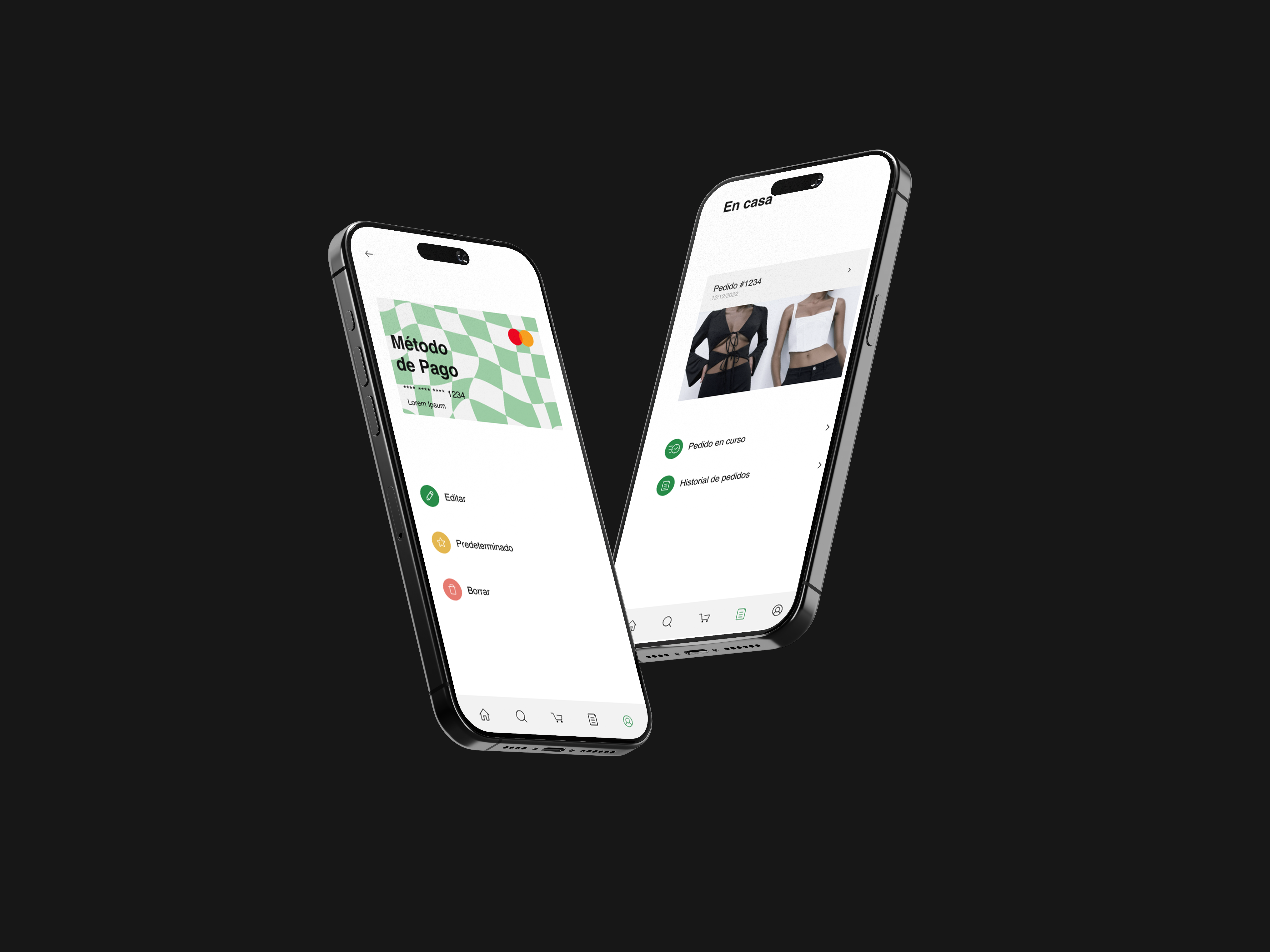
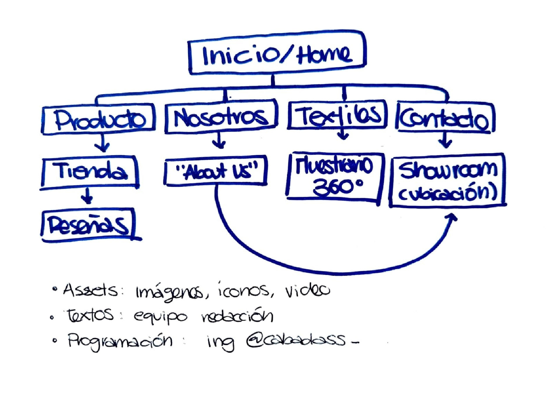
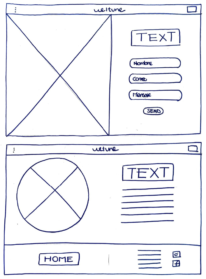
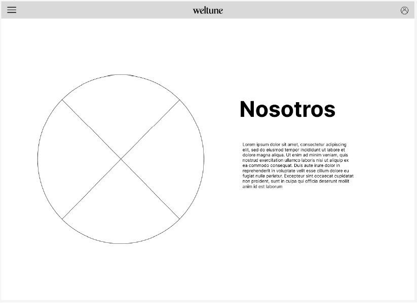
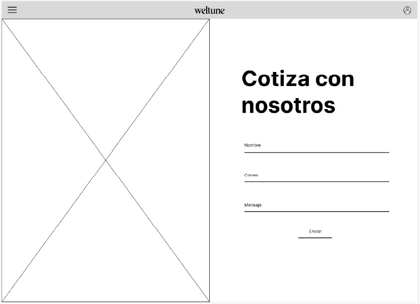
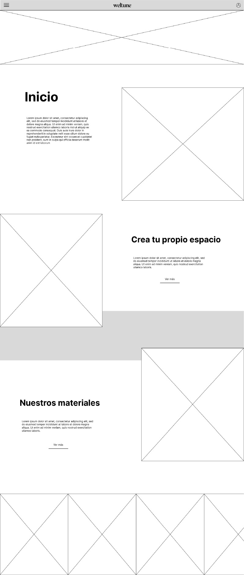
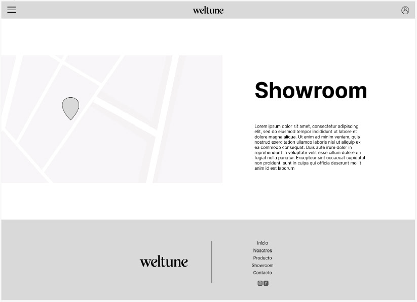
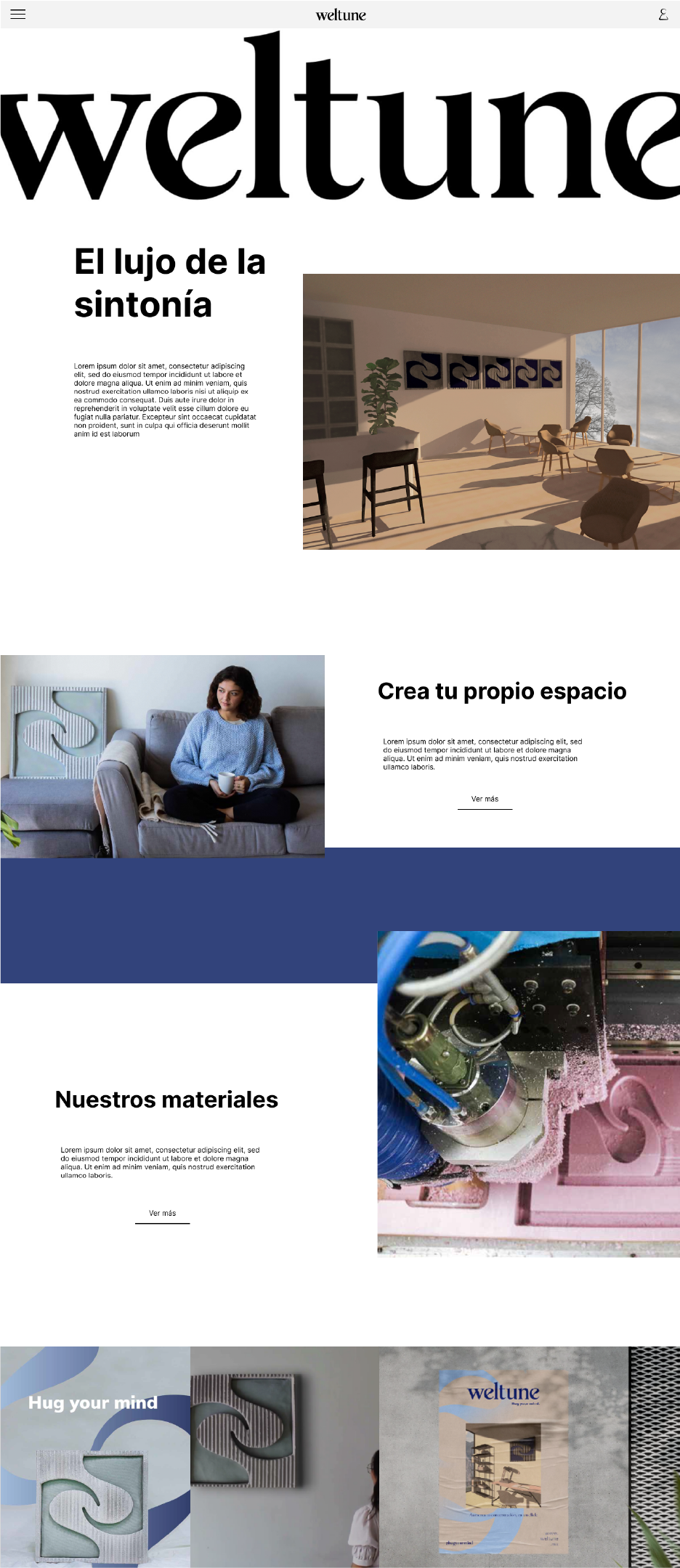
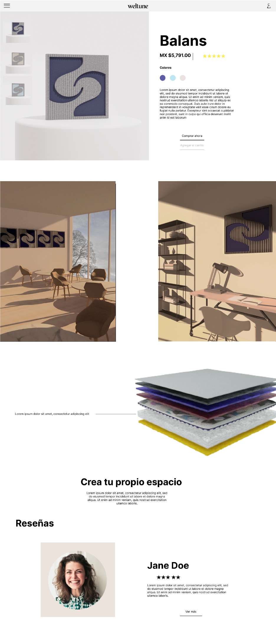
In the subsequent phase, we focused on the digital experience and its presentation to users, leading to the development of the website. The site serves as the primary redirection platform within the social media strategy and is the sole purchase channel for the company. The website architecture is divided into five sections: Home, About Us, Product, Textiles, and Contact.
Each page features call-to-action buttons that direct users to the purchase page, and includes photographs of the product from various angles. During the ideation process, design concepts were reviewed directly with stakeholders to ensure a seamless user experience and maintain a 'happy path' for product purchases.


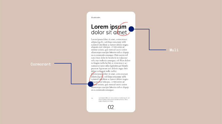
For the graphic identity, the 'Muli' typeface was used in bold, regular, and black weights due to its legibility and harmony with the logo and graphic elements. These different weights were selected to emphasize and contrast with the 'Cormorant' typeface, which will be used in its regular, semibold, and bold italic versions.
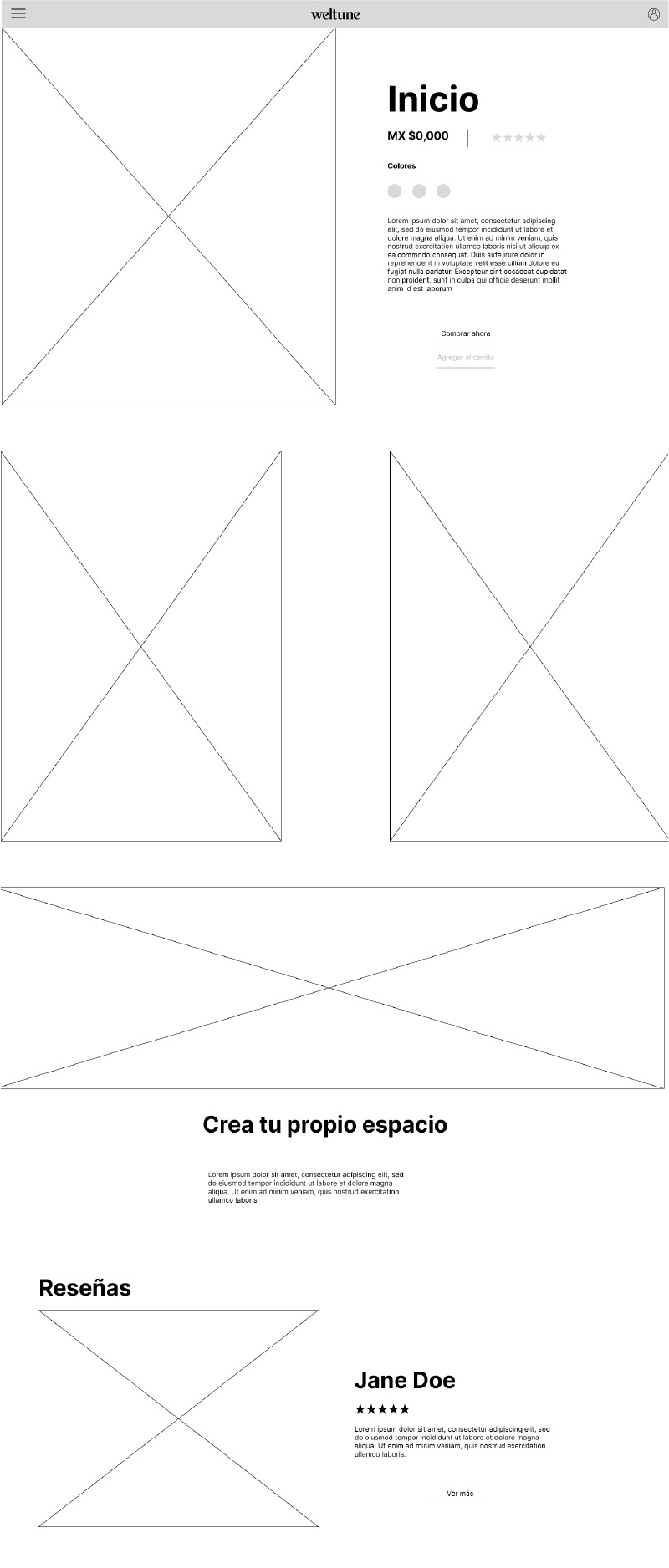
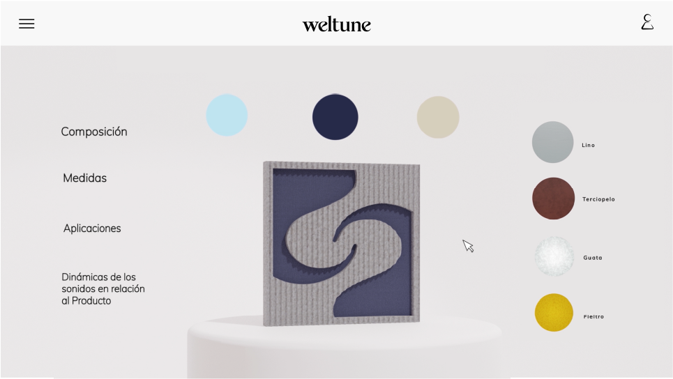
On the website, users can explore various options in the textile section, allowing them to customize their products from scratch. The main page features a tab named 'Acoustic Properties (Textiles)' where users can interact with a sampler and experience its various functionalities.
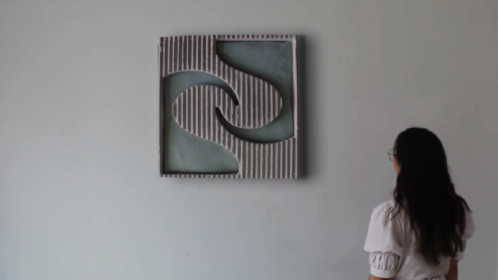
Upon accessing the textiles main page, users will first see our product proposal: the 'Balans' panel. This panel is presented with an interactive 360-degree view. At the top of the screen, a subtab displays three color options for the panel cover, using Pantone shades: Quite Tide (a light blue), Ocean Cavern (a dark blue), and Almond Milk (a sand color).